RGB & CMYK – Concepts and Differences
When talking about colors, in the context of the contemporary computerized epoch we live in, it is inevitable not to mention RGB and CMYK. Probably those of you who are designers or work in the press industry know what it is all about, but I bet that there are guys who see these abbreviations for the first time.
RGB
To begin with RGB which stand for Red, Green and Blue. It is a scheme for representing colors through digital devices like TV screens, monitors and projectors. While reading this article, all that you see are RGB colors. Every one of them is represented by a combination of three numbers (each number is respectively for Red, Green and Blue) that vary from 0 to 255. 0 indicates the absence of the pigment and 255 indicates the absolute presence. For example: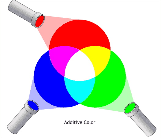
- 255, 0, 0 is the numeric equivalence of Red;
- 0, 255, 0 – Green;
- 0, 0,255 – Blue;
- 0, 0, 0 – Black;
- 255,255,255 – White;
- 0,255,255 – Yellow;
As you might have already guessed so much combinations result in an immense gamut of tints – more than 16 millions. The difference between some of them is so slight that it can’t be spotted with bare eyes.
CMYK
We continue with CMYK. It is again a color model that is mainly adopted by the conventional offset digital printers and press industry where colors are represented on paper, not on a screen. As long as RGB is more popular than CMYK when first seeing these four letters you are/were probably like:
And this is understandable. Relax, it is easier than you suppose. CMYK is a method of printing where colors are printed using four inks – Cyan, Magenta, Yellow and Black. Just like the RGB, different combinations of ink represent different colors. Instead of numbers this model uses percentages. The higher the percentage for a particular ink is, the more of that ink will be printed. There is a kind of unwritten rule that the total ink density should be between 250% and 300%. 
Something interesting is the fact that at first it wasn’t CMYK but CMY. “Why do we need black, when we can get it by combining 100% of Cyan, Magenta and Yellow?” That was the original idea, but the result of this triple combination was not black but something more like a gloomy brown. Because of this a fourth color – black – was added, which allowed darker black to be produced.
Is there a difference?
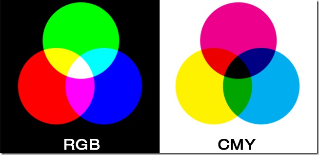 Yes, there is. Firstly they are used for different purposes and this to some point makes the dispute “RGB vs. CMYK” meaningless. To put it bluntly – RGB is better for digital devices and CMYK is better for printing. Moreover the next thing that makes them differ from each other is the principle of color representing. RGB tints are called additive and CMYK – subtractive. This is because monitors emit light and paper absorbs it. On a screen you begin with a dark foundation and by adding light you get colors. This practically is the function of the three numbers – to define the amount of light beamed from the pixels for each of the Red, Green and Blue pigments. That is why 0, 0, 0 – no light emitted – is black and 255,255,255 is white. On paper everything is the opposite. You begin with a white foundation – a sheet. Cyan, Magenta, Yellow and Black ink serve as filter that subtracts different specters of the white light that is reflected by the paper. As you were taught in your physics classes the blue, red,purple, green, yellow specters altogether form white light. When some of them are absent the light changes its color. Percentages in the CMYK model define what and how much of these specters will be absorbed and what color will reach the human eye. That is why 0%, 0%, 0%, 0% means no ink and no light absorbed and 100%, 100%, 100%, 100% means maximum ink and all the light absorbed, resulting in pure black.
Conversion from RGB to CMYK.
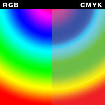
 Different color capacities of the two models arouse kind of an inconvenience for the modern designers and photographers. As I already mentioned, RGB supports more than 16 000 000 variations and CMYK can’t represent all of them. While browsing photos on your computer or drawing something in Photoshop you see it in RGB by default and everything is fine, but when deciding to print it on paper things might not be quite the same. Because of the reduced range of tints, some of the vibrant and vivacious color, present in RGB are not present in CMYK. That is why the RGB blue is more like purple in CMYK space, and dark red is more like brown. (Bear in mind all the CMYK colors shown in this article are not exactly CMYK colors but an approximations because you are seeing them on a LCD display).
If you print picture at home there are no problems if the result is unsatisfactory but if you need to print something for work, then things get serious and you have to call professional printers on the stage. That is where problems might start. When receiving a RGB, most of the printing houses change it to CMYK on their own because professional printers don’t work with Red/Green/Blue images. If any major differences occur in the colors, which sometimes is inevitable, they say it is not their responsibility. The question is what can you do in order to preserve the quality of your graphics? Luckily the contemporary graphic editors support CMYK preview mode which is an example of the way the printed product will look. Thus you are able to see the difference and to make any alterations if necessary before actually converting from RGB to CMYK.
 “So why don’t we use CMYK mode right from the beginning? Wouldn’t it be easier?” That’s a good question but the answer in No. Firstly CMYK file are bigger and harder to be processed by the computer than the RGB ones. You can always turn RGB to CMYK before printing, but if you have to do the opposite, the method is much more difficult. Furthermore constant conversion from the one mode to the other in not very “healthy” for the picture itself and can result in diminished color quality.
How can we overcome the problem with the reduced CMYK gamut?
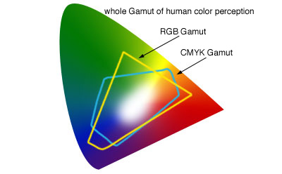 Technologies save the day again. Due to special techniques color vivacity can be maintained and the printed version of your picture can get closer to the screen version. One of them is the ICC profile which is attached to your RGB image. When the guys from the printing house convert the picture to CMYK, the ICC profile plays a crucial role for pigments preservation. Another one is the so called Pantone Color Matching System which greatly expands the CMYK gamut.
There are even predictions about the future according to which from RGB and CMYK only RGB will survive. Thus everything will be more generalized and users won’t be bothered with color conversions. Furthermore there won’t be a difference between the picture on your desktop and the picture in your hand. Of course RGB ink printers aren’t still present or are extremely rare so if you need to use any professional printing services trust CMYK – it is the color space for you.
