Attractive & Interesting QR – What’s the Secret?
There is no doubt that QRs are and will continue to be inseparable part of our lives. If you look around right now, I am sure that there will be a QR code nearby. On packages, cartons, tins and bottles, in TV commercials, on posters and in the public transport – they are put everywhere with one main purpose – to interact the user and to promote. In order to be successful QR advertiser, you have to be innovative and constantly to come up with original ideas that would hold the attention of the customers. Below I will show you some interesting examples and a few ideas, supported with a few tips, which would prevent a future failure of your QR campaign.
Take the Korean Emart from Seoul that uses 3D QR code to increase their sales. It is a sculpture that is positioned at a particular place, at a particular angle. It becomes readable only between 12 and 1 pm when the protruding blocks throw specific shadow, which is the black color of the QR. After scanning, the client receives a discount coupon for shopping at the Emart. Eventually, thanks to their unique approach, these guys got 25% sales increase during the “quiet lunch zone”.
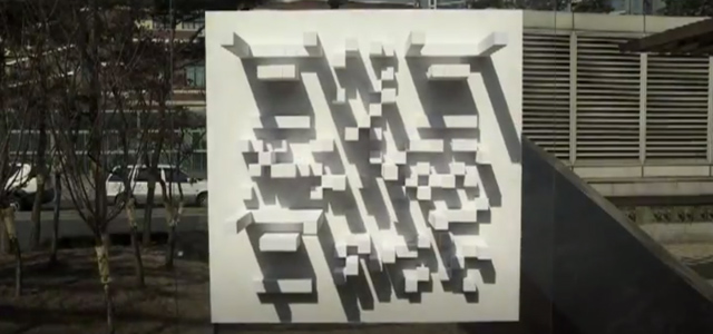 If you really give it a though you will see that what is more important is the way you interact your target group. Most of the customers appreciate the discount, but what they appreciate more is the way it was gained. When something big like this in Seoul happens, it receives huge media coverage and reaches more and more people. As a result some of them might go only to see it and by the way to buy something cheaply. Of course this 3D QR is not the perfect advertising tool. Its creators obviously have not considered the cases when the weather is cloudy or rainy. Probably that is why the campaign is called “Sunny Sale”.
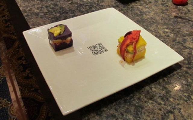
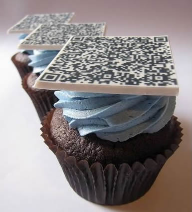 If you to offer your clients an exceptional experience, try something off the beaten track like edible QRs. Such can already be seen in clevercupcakesmontreal.com. On the cupcake a sugar plate is placed with a QR that redirects to the Montreal Science Center website, before eaten of course. The concept is great and definitely attractive but it would be a real challenge for the cook if he had to make different QRs for the different cakes. Another idea that is that good but less effort-consuming would be to place QRs at the bottom of the plates in restaurants. If you go for a lunch and order 4-course meal things would be much faster. When finished with the main dish, instead of waiting for the waiter to spot you and to serve you the desert, simply scan the code. Your phone will transmit a signal to the server of the restaurant, telling the chief-waiter on which table what has to be served.
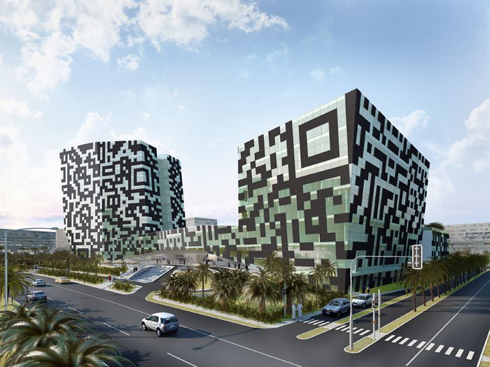
 Let’s leave aside all the QR T-shirts, tattoos and clothes and talk about the “Big Boys”. Have you heard of the hotel that is going to be built in Dubai with QR for façade? It will be a whole complex which is meant to represent a sci-fi setting and the Quick Responsive code has a substantial role in it. Move on to the QR in the crop field in Germany with dimensions 160x160m which was made by enthusiasts particularly for Google Maps. Wow, sounds massive! Next in the list is the QR which consisted of 50 people. They were holding black and white squares, 1, 5×1, 5m over their heads. After being scanned from certain height the giant puzzle leads to a special animation which honored the 100th anniversary of Audi. Incredible and again immense. Apparently concepts of advertising smartly and interestingly with Quick Responsive codes are numerous.
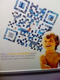
 Once come up with a good idea, you have to realize it effectively, because no matter how original and amazing it is, if the user is not satisfied and intrigued, in the end everything will be pointless and your time and efforts will be wasted. Perfect example for such case is the company JetBlue that has made a poster with a QR. It was composed of many rectangular photos of people on a vacation. The poster was great and catched the eye, but the place where positioned – in a subway – led to poor results. Under the ground cell phones have low internet connectivity and can’t really load the web page. Place of positioning is crucial and should be carefully considered. At first the subway seems to be appropriate – many people who are waiting and are eager to fill their time by reading a beautiful QR. OK but this happens underground and all the performed scans are resultless. QRs for advertising should be not only good-looking, but readily accessible too.
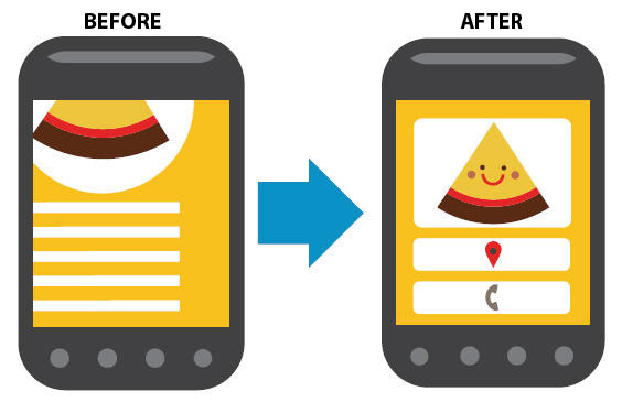
 The other key factor is the landing page to which the code redirects. When pointing his/her phone’s camera at a Quick Responsive black-and-white square, the user expects to be provided with optimized content. In the most cases this doesn’t happen and the client is bitterly disappointed. Thus a bad name can be aerned not only for the company, but for the QR codes at all. If you want to be successful offer only mobile-friendly pages or information. Read more about “How to make my QR nicer for 5 mins?“. Here you can find all Mobilio’s barcode generator including QREncoder.
